> ## Documentation Index
> Fetch the complete documentation index at: https://docs.stratumn.com/llms.txt
> Use this file to discover all available pages before exploring further.
# Widgets
A *widget* is a term used to represent an atomic UI element associated with specific data.
It serves as a versatile tool that adds context based on the trace state.
Its primary objective is to deliver meaningful insights to end users, offering a clear understanding of the progress made in the process.
Since users may have varying preferences for the information displayed,
it is essential to create a configuration file aligned with the principles used for the overview table configuration.
# Views
A *view* is a keyword we use to define an atomic display of a piece of data. We provide core views which are fundamental to displaying correctly various natures of data.
All the views have the common property:
The type of view to display.
Widget views can be used in the [workflow overview](/configuration/ui/introduction#workflow-overview) and the [trace infos](/configuration/ui/introduction#trace-infos) via their dedicated configuration files.
## Text
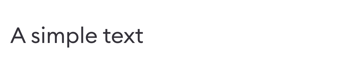
The `text` view enables to display a piece of data as plain text. If the text is too long, an ellipses will be displayed. \
This is the default view used if a view **type** is invalid.
 The type of the view, must be equal to `text`, or undefined.
The path to the data to be displayed.
If the provided path resolves to a [SlateJS](https://docs.slatejs.org/) object, this option will display the data as a rich text.
The default value to display if the data found at path is empty.
```ts Typescript theme={null}
type TextView = {
type?: 'text';
path: string;
default?: string;
isRichText?: boolean;
}
```
```json Simple usage theme={null}
{
"type": "text",
"path": "data.order.name"
}
```
The [JMESPath](https://jmespath.org/specification.html) syntax is very powerful and can be used to build complex expressions.
For example, the path `"['Hello ',userName,', how are you?'].join('',@)"` will produce `"Hello ${userName}, how are you?"`.
## Id
The `id` view displays an id as plain text. The user can copy the id to the clipboard by clicking on it.
The type of the view, must be equal to `text`, or undefined.
The path to the data to be displayed.
If the provided path resolves to a [SlateJS](https://docs.slatejs.org/) object, this option will display the data as a rich text.
The default value to display if the data found at path is empty.
```ts Typescript theme={null}
type TextView = {
type?: 'text';
path: string;
default?: string;
isRichText?: boolean;
}
```
```json Simple usage theme={null}
{
"type": "text",
"path": "data.order.name"
}
```
The [JMESPath](https://jmespath.org/specification.html) syntax is very powerful and can be used to build complex expressions.
For example, the path `"['Hello ',userName,', how are you?'].join('',@)"` will produce `"Hello ${userName}, how are you?"`.
## Id
The `id` view displays an id as plain text. The user can copy the id to the clipboard by clicking on it.
 The type of the view, must be equal to `id`.
A JMESPath that resolves to an id.
```ts Typescript theme={null}
type IdView = {
type: 'id';
path: string;
}
```
## Number
The `number` view displays a piece of data as formatted number.
The type of the view, must be equal to `id`.
A JMESPath that resolves to an id.
```ts Typescript theme={null}
type IdView = {
type: 'id';
path: string;
}
```
## Number
The `number` view displays a piece of data as formatted number.
 The type of the view, must be equal to `number`.
A JMESPath that resolves to a number.
Settings to format the displayed number using the [Number toLocaleString()](https://www.w3schools.com/jsref/jsref_tolocalestring_number.asp) method.
A locale string or array of locale strings that contain one or more language or locale tags.
If you include more than one locale string, list them in descending order of priority so that the first entry is the preferred locale.
An object that contains one or more properties that specify comparison options.
See [Number toLocaleString()](https://www.w3schools.com/jsref/jsref_tolocalestring_number.asp) for the list of options.
A JMESPath that resolves to a number. This feature allows adding context to the displayed number by appending a " / denominator" to it.
This is useful, for instance, when showing the number of steps completed out of a total expected.
The same format is applied to the denominator.
If enabled, the number will appear on the right side of the tab.
```ts Typescript theme={null}
type NumberView = {
type: 'number';
path: string;
denominatorPath?: string;
tabRight?: boolean;
format?: {
options?: Intl.NumberFormatOptions;
local?: string | string[];
};
};
```
```json Simple usage theme={null}
{
"type": "number",
"path": "data.amount",
"tabRight": true,
"format": { "options": { "minimumFractionDigits": 2 } }
}
```
## Date
The `date` view displays a formatted date and supports a deadline warning feature. This feature displays the date in red with a warning icon if it's past or too close to today.
The type of the view, must be equal to `number`.
A JMESPath that resolves to a number.
Settings to format the displayed number using the [Number toLocaleString()](https://www.w3schools.com/jsref/jsref_tolocalestring_number.asp) method.
A locale string or array of locale strings that contain one or more language or locale tags.
If you include more than one locale string, list them in descending order of priority so that the first entry is the preferred locale.
An object that contains one or more properties that specify comparison options.
See [Number toLocaleString()](https://www.w3schools.com/jsref/jsref_tolocalestring_number.asp) for the list of options.
A JMESPath that resolves to a number. This feature allows adding context to the displayed number by appending a " / denominator" to it.
This is useful, for instance, when showing the number of steps completed out of a total expected.
The same format is applied to the denominator.
If enabled, the number will appear on the right side of the tab.
```ts Typescript theme={null}
type NumberView = {
type: 'number';
path: string;
denominatorPath?: string;
tabRight?: boolean;
format?: {
options?: Intl.NumberFormatOptions;
local?: string | string[];
};
};
```
```json Simple usage theme={null}
{
"type": "number",
"path": "data.amount",
"tabRight": true,
"format": { "options": { "minimumFractionDigits": 2 } }
}
```
## Date
The `date` view displays a formatted date and supports a deadline warning feature. This feature displays the date in red with a warning icon if it's past or too close to today.
 The type of the view, must be equal to `date`.
A JMESPath that resolves to a date string.
The format to apply to the date when displaying. Uses the [moment.js formats](https://momentjs.com/docs/#/displaying/format/).
Enables the deadline warning feature if set to `true`.
The number of days before the deadline to start showing the warning. For example, `5` means the warning appears 5 days before the deadline.
A path to a value that disables the warning feature if it evaluates to `true` (e.g., when the task is flagged as "Done").
The icon ID to use for the warning. Default is `'Clock'`.
```ts Typescript theme={null}
type DateView = {
type: 'date';
path: string;
format?: string;
} & (
| {
isDeadline?: false;
}
| {
isDeadline: true;
deadlineWarningBuffer?: number;
donePath?: string;
deadlineWarningIcon?: string;
}
);
```
```json Simple usage theme={null}
{
"type": "date",
"path": "data.dueDate",
"isDeadline": true,
"deadlineWarningBuffer": 7,
"donePath": "data.isTraceClosed",
"format": "MM/DD/YYYY",
}
```
## Progress bar
The progress bar view displays a percentage value in a classic progress bar
which changes color based on predefined ranges of progress.
The type of the view, must be equal to `date`.
A JMESPath that resolves to a date string.
The format to apply to the date when displaying. Uses the [moment.js formats](https://momentjs.com/docs/#/displaying/format/).
Enables the deadline warning feature if set to `true`.
The number of days before the deadline to start showing the warning. For example, `5` means the warning appears 5 days before the deadline.
A path to a value that disables the warning feature if it evaluates to `true` (e.g., when the task is flagged as "Done").
The icon ID to use for the warning. Default is `'Clock'`.
```ts Typescript theme={null}
type DateView = {
type: 'date';
path: string;
format?: string;
} & (
| {
isDeadline?: false;
}
| {
isDeadline: true;
deadlineWarningBuffer?: number;
donePath?: string;
deadlineWarningIcon?: string;
}
);
```
```json Simple usage theme={null}
{
"type": "date",
"path": "data.dueDate",
"isDeadline": true,
"deadlineWarningBuffer": 7,
"donePath": "data.isTraceClosed",
"format": "MM/DD/YYYY",
}
```
## Progress bar
The progress bar view displays a percentage value in a classic progress bar
which changes color based on predefined ranges of progress.
 The type of the view, must be equal to `progress`.
A JMESPath that resolves to a number, usually between 0 and 1.
Allows scaling the number resolved using the `path`,
allowing it to not necessarily be between 0 and 1.
```ts Typescript theme={null}
type ProgressView = {
type: 'progress';
path: string;
denominatorPath?: string;
}
```
```json Simple usage theme={null}
{
"type": "progress",
"path": "data.status.progress",
}
```
## Labels
The `labels` view displays a list of strings as a set of labels.
The type of the view, must be equal to `progress`.
A JMESPath that resolves to a number, usually between 0 and 1.
Allows scaling the number resolved using the `path`,
allowing it to not necessarily be between 0 and 1.
```ts Typescript theme={null}
type ProgressView = {
type: 'progress';
path: string;
denominatorPath?: string;
}
```
```json Simple usage theme={null}
{
"type": "progress",
"path": "data.status.progress",
}
```
## Labels
The `labels` view displays a list of strings as a set of labels.
 The type of the view, must be equal to `progress`.
A JMESPath that resolves to a list of strings to be displayed.
```ts Typescript theme={null}
type LabelsView = {
type: 'labels';
path: string;
}
```
```json Simple usage theme={null}
{
"type": "labels",
"path": "data.favoriteMeals",
}
```
## Status
The `status` displays a progress as well as the name of the status at the same time.
The type of the view, must be equal to `progress`.
A JMESPath that resolves to a list of strings to be displayed.
```ts Typescript theme={null}
type LabelsView = {
type: 'labels';
path: string;
}
```
```json Simple usage theme={null}
{
"type": "labels",
"path": "data.favoriteMeals",
}
```
## Status
The `status` displays a progress as well as the name of the status at the same time.
 The type of the view, must be equal to `status`.
A path that resolves to a string representing the status name.
A path that resolves to a number between 0 and 1, representing the progress of the status.
The diameter of the progress circle, in pixels.
The value that represents the status as cancelled.
In some workflows 0% is not cancel, so we need to specify a cancel value to prevent 0% override.
```ts Typescript theme={null}
type StatusWidget = {
type: 'status';
path: string;
progressPath: string;
progressSize?: number;
cancelValue?: number;
}
```
```json Simple usage theme={null}
{
"type": "status",
"path": "data.status.name",
"progressPath": "data.status.progress"
}
```
## Key-value
The `keyValue` view displays any widget (usually a text) nested under a label.
This widget is usually used to display relevant data in the [trace infos](/configuration/ui/introduction#trace-infos).
☝️ View an example of how the `keyValue` view appears here.
The type of the view, must be equal to `keyvalue`.
The label as plain text, describing the pair.
Any valid widget view.
```ts Typescript theme={null}
type KeyValueWidget = {
type: 'keyValue';
key: string;
value: WidgetView;
}
```
```json Simple usage theme={null}
{
"type": "keyValue",
"key": "Status",
"value": {
"view": {
"type": "status",
"path": "data.status.name",
"progressPath": "data.status.progress"
}
}
}
```
## Icon
The `icon` view displays an icon, which can be static or resolved dynamically from a path.
A label can be displayed next to the icon.
The type of the view, must be equal to `status`.
A path that resolves to a string representing the status name.
A path that resolves to a number between 0 and 1, representing the progress of the status.
The diameter of the progress circle, in pixels.
The value that represents the status as cancelled.
In some workflows 0% is not cancel, so we need to specify a cancel value to prevent 0% override.
```ts Typescript theme={null}
type StatusWidget = {
type: 'status';
path: string;
progressPath: string;
progressSize?: number;
cancelValue?: number;
}
```
```json Simple usage theme={null}
{
"type": "status",
"path": "data.status.name",
"progressPath": "data.status.progress"
}
```
## Key-value
The `keyValue` view displays any widget (usually a text) nested under a label.
This widget is usually used to display relevant data in the [trace infos](/configuration/ui/introduction#trace-infos).
☝️ View an example of how the `keyValue` view appears here.
The type of the view, must be equal to `keyvalue`.
The label as plain text, describing the pair.
Any valid widget view.
```ts Typescript theme={null}
type KeyValueWidget = {
type: 'keyValue';
key: string;
value: WidgetView;
}
```
```json Simple usage theme={null}
{
"type": "keyValue",
"key": "Status",
"value": {
"view": {
"type": "status",
"path": "data.status.name",
"progressPath": "data.status.progress"
}
}
}
```
## Icon
The `icon` view displays an icon, which can be static or resolved dynamically from a path.
A label can be displayed next to the icon.
 The type of the view, must be equal to `icon`.
A static icon id to be displayed if the `iconPath` does not resolve to a *truthy* value.
A JMESPath that resolves to an icon id.
Renders the *Document* icon if the resolved value is falsy, or the icon defined in `icon` (see above) if it's set.
A JMESPath that resolves to a string displayed as a label next to the icon.
A JMESPath that if resolves to a *truthy* value will trigger the display of the icon.
By default, the icon is displayed if the path is not set.
```ts Typescript theme={null}
type IconWidget = {
type: 'icon';
iconPath?: string;
icon?: string;
labelPath?: string;
path?: string;
}
```
```json Simple usage theme={null}
{
"type": "icon",
"iconPath": "meta.head.action.icon",
"labelPath": "meta.head.action.title"
}
```
## Boolean
The `boolean` view displays a checkmark if the path resolves to a *truthy* value.\
It is similar to the [icon view](/configuration/ui/widgets#icon) but with a simpler configuration.
☝️ View an example of how the `boolean` view appears here.
The type of the view, must be equal to `boolean`.
A JMESPath that resolves to a boolean value which, if truthy, will display the checkmark.
```ts Typescript theme={null}
type BooleanWidget = {
type: 'boolean';
path: string;
}
```
```json Simple usage theme={null}
{
"type": "boolean",
"path": "data.isValid"
}
```
## Link
The `link` view displays an HTML link. It has the same configuration as the [Link Wrapper](/configuration/ui/widgets#link-wrapper) view.
☝️ View an example of how the `link` view appears here.
The type of the view, must be equal to `link`.
A JMESPath that resolves to a string. This text will be displayed as the link content.
If no `urlPath` is provided or its resolved value is falsy, the resolved value of the path will also act as the link url.
The root of the url, as plain text.
A JMESPath that resolves to a string, which will be used as the url suffix.
Whether to open the link in a new browser tab or in the current one.
```ts Typescript theme={null}
type LinkWidget = {
type: 'link';
path: string;
rootUrl?: string;
urlPath?: string;
openInNewTab?: boolean;
}
```
```json Simple usage theme={null}
{
"type": "link",
"path": "'The documentation'",
"rootUrl": "https://",
"urlPath": "data.documentationUrl",
"openInNewTab": false
}
```
## Wrappers
Wrappers are components that wrap other widgets.
### Link Wrapper
### Window Wrapper
### Tooltip Wrapper
The type of the view, must be equal to `icon`.
A static icon id to be displayed if the `iconPath` does not resolve to a *truthy* value.
A JMESPath that resolves to an icon id.
Renders the *Document* icon if the resolved value is falsy, or the icon defined in `icon` (see above) if it's set.
A JMESPath that resolves to a string displayed as a label next to the icon.
A JMESPath that if resolves to a *truthy* value will trigger the display of the icon.
By default, the icon is displayed if the path is not set.
```ts Typescript theme={null}
type IconWidget = {
type: 'icon';
iconPath?: string;
icon?: string;
labelPath?: string;
path?: string;
}
```
```json Simple usage theme={null}
{
"type": "icon",
"iconPath": "meta.head.action.icon",
"labelPath": "meta.head.action.title"
}
```
## Boolean
The `boolean` view displays a checkmark if the path resolves to a *truthy* value.\
It is similar to the [icon view](/configuration/ui/widgets#icon) but with a simpler configuration.
☝️ View an example of how the `boolean` view appears here.
The type of the view, must be equal to `boolean`.
A JMESPath that resolves to a boolean value which, if truthy, will display the checkmark.
```ts Typescript theme={null}
type BooleanWidget = {
type: 'boolean';
path: string;
}
```
```json Simple usage theme={null}
{
"type": "boolean",
"path": "data.isValid"
}
```
## Link
The `link` view displays an HTML link. It has the same configuration as the [Link Wrapper](/configuration/ui/widgets#link-wrapper) view.
☝️ View an example of how the `link` view appears here.
The type of the view, must be equal to `link`.
A JMESPath that resolves to a string. This text will be displayed as the link content.
If no `urlPath` is provided or its resolved value is falsy, the resolved value of the path will also act as the link url.
The root of the url, as plain text.
A JMESPath that resolves to a string, which will be used as the url suffix.
Whether to open the link in a new browser tab or in the current one.
```ts Typescript theme={null}
type LinkWidget = {
type: 'link';
path: string;
rootUrl?: string;
urlPath?: string;
openInNewTab?: boolean;
}
```
```json Simple usage theme={null}
{
"type": "link",
"path": "'The documentation'",
"rootUrl": "https://",
"urlPath": "data.documentationUrl",
"openInNewTab": false
}
```
## Wrappers
Wrappers are components that wrap other widgets.
### Link Wrapper
### Window Wrapper
### Tooltip Wrapper