> ## Documentation Index
> Fetch the complete documentation index at: https://docs.stratumn.com/llms.txt
> Use this file to discover all available pages before exploring further.
# Overview table
The table component in Trace-UI is a versatile tool for displaying lists of data objects. In the context of Trace-UI, it is specifically utilized to display, filter, and sort traces within a workflow. Each trace corresponds to a row in the table, with cells representing distinct aspects of the trace state.
## Example Table
Below is an example of a table produced using the Workflow Overview Table:
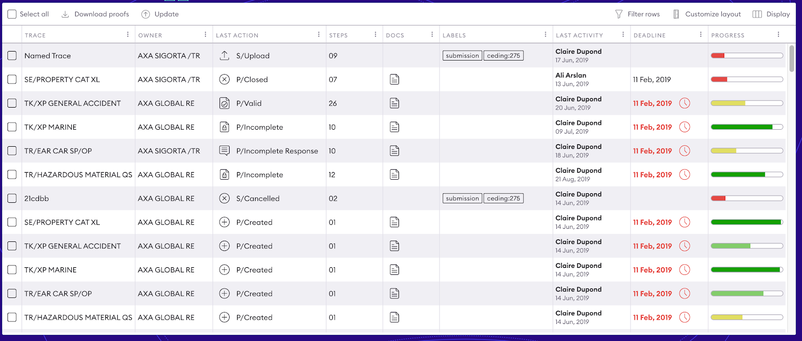 The table is built using a **display configuration document** that defines how data is read and displayed for each column. The display adapts to the structure of the trace state defined in the workflow.
> **Note**: To optimize performance and responsiveness, Trace-UI employs the React-Window library for virtualization. This ensures only visible rows (plus a buffer) are rendered, with additional rows dynamically loaded during scrolling.
***
## Sorting the Table
The sorting feature allows you to reorder the rows of a table based on the value of the columns. Users can click on a column header to sort the data in ascending or descending order.
Default Behavior
* Each column in the table can be sorted, unless otherwise specified in the configuration.
* The initial sort (if defined) is applied as soon as the table is loaded.
* Columns can be sorted by clicking on their headers:
* First click: sort ascending.
* Second click: sort descending.
* Third click: sort deactivated.
Sorting Configuration
To enable or configure sorting, use the sortSetup field in the table configuration:
```json theme={null}
"sortSetup": {
"key": "age",
"direction": "a"
}
```
### Parameters
* `key`: Specifies the key of the column on which the sort is applied.
direction:
* `a`: Sort ascending (default).
* `d`: Sort descending.
Initial Sort Configuration Example
```json theme={null}
{
"columns": [
{ "key": "name", "sortable": true },
{ "key": "age", "sortable": true },
{ "key": "address", "sortable": false }
],
"sortSetup": {
"key": "age",
"direction": "a"
}
}
```
In this example:
* The `name` and `age` columns are sortable.
* The `address` column is not sortable.
* The initial sort is configured on the `age` column in ascending order.
## Multi-column and complex sorting
Some advanced implementations allow sorting by multiple columns. This feature requires additional configuration or development to allow the user to define multiple sort levels via the interface or configuration.
Interaction with other features
Sorting applies to the data visible in the table. It is compatible with:
* **Filtering**, by sorting only the filtered results.
* **Export**, where the exported data follows the order defined by the sort.
## Filtering the Table
Filtering enables users to narrow down data by specifying conditions on column values.
### How It Works
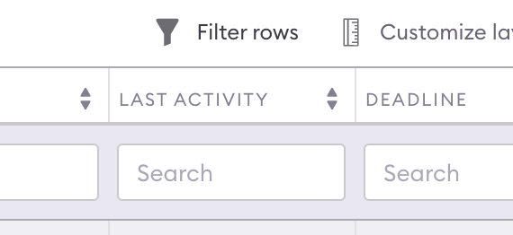
Clicking the **Filter** icon in a table header reveals the filtering interface for that column. Each column includes a filter input below its header.
The table is built using a **display configuration document** that defines how data is read and displayed for each column. The display adapts to the structure of the trace state defined in the workflow.
> **Note**: To optimize performance and responsiveness, Trace-UI employs the React-Window library for virtualization. This ensures only visible rows (plus a buffer) are rendered, with additional rows dynamically loaded during scrolling.
***
## Sorting the Table
The sorting feature allows you to reorder the rows of a table based on the value of the columns. Users can click on a column header to sort the data in ascending or descending order.
Default Behavior
* Each column in the table can be sorted, unless otherwise specified in the configuration.
* The initial sort (if defined) is applied as soon as the table is loaded.
* Columns can be sorted by clicking on their headers:
* First click: sort ascending.
* Second click: sort descending.
* Third click: sort deactivated.
Sorting Configuration
To enable or configure sorting, use the sortSetup field in the table configuration:
```json theme={null}
"sortSetup": {
"key": "age",
"direction": "a"
}
```
### Parameters
* `key`: Specifies the key of the column on which the sort is applied.
direction:
* `a`: Sort ascending (default).
* `d`: Sort descending.
Initial Sort Configuration Example
```json theme={null}
{
"columns": [
{ "key": "name", "sortable": true },
{ "key": "age", "sortable": true },
{ "key": "address", "sortable": false }
],
"sortSetup": {
"key": "age",
"direction": "a"
}
}
```
In this example:
* The `name` and `age` columns are sortable.
* The `address` column is not sortable.
* The initial sort is configured on the `age` column in ascending order.
## Multi-column and complex sorting
Some advanced implementations allow sorting by multiple columns. This feature requires additional configuration or development to allow the user to define multiple sort levels via the interface or configuration.
Interaction with other features
Sorting applies to the data visible in the table. It is compatible with:
* **Filtering**, by sorting only the filtered results.
* **Export**, where the exported data follows the order defined by the sort.
## Filtering the Table
Filtering enables users to narrow down data by specifying conditions on column values.
### How It Works
Clicking the **Filter** icon in a table header reveals the filtering interface for that column. Each column includes a filter input below its header.
 ### Filtering Configuration
Filtering configuration determines both the interface and the logic for executing filters. For example:
```json theme={null}
{
"type": "text",
"path": "name",
"interpreter": {
"type": "search"
}
}
```
#### Configuration Fields
* **type**: Specifies the filtering interface type.
* **path**: Defines the data path to filter. Paths pointing to objects are stringified for global searches.
* **interpreter**: Configures filtering logic (default: `{"type": "search"}`).
Column-specific filtering can be customized using the `filter` field in column configuration. For example, nested information (e.g., tooltips or modals) can use custom filters. By default, rows with `undefined` values are excluded.
### Filtering Interface Types
#### Text Filtering
A text input with a debounce of 250ms updates filters. Multiple filter values can be specified using commas.
* **placeholder**: Optional text displayed when the filter is empty (default: `search`).
#### Filtering Interpreter Options
* **Search Filter**: Filters by matching substrings (case-insensitive).
* **Regex Filter**: Filters using regular expressions.
* **flags**: Options like `i` for case-insensitivity.
* **Number Filter**: Filters by numeric comparisons. Supported operators include:
* `n`: Exact match.
* `n`: Less/greater than.
* `n<
#### Configuration Example
For dates:
```json theme={null}
{
"filter": {
"type": "select",
"path": "data.weekStartDate",
"enum": [
{ "label": "10/05/2021", "value": "2021-05-10" },
{ "label": "05/10/2022", "value": "2022-10-05" }
]
}
}
```
For numbers:
```json theme={null}
{
"filter": {
"type": "select",
"path": "data.progressValue",
"enum": [
{ "label": "10%", "value": "0.1" },
{ "label": "50%", "value": "0.5" }
],
"interpreter": { "type": "number" }
}
}
```
***
## Aggregating
For locally stored tables, aggregation computes operations on the entire dataset. Activating the aggregation switch adds a new row at the bottom of the table.
### Global Aggregation Configuration
Customize the aggregation switch label using:
```json theme={null}
"aggregation": {
"label": "Custom Switch Label"
}
```
### Column Aggregation Configuration
Aggregation is defined per column. The widget receives the entire dataset:
```json theme={null}
{
"data": [ {...rowData} ]
}
```
#### Example: Average Calculation
To compute the average of a column:
```json theme={null}
{
"view": {
"path": "data[].amount | avg(@)",
"type": "number"
}
}
```
Default behavior:
* Numerical columns: Summation.
* Other columns: No aggregation.
***
## Customization
Table customization allows users to adjust the display to their needs. These preferences are stored in the browser's local storage and persist until cleared manually or programmatically.
### Local Storage Structure
Example:
```json theme={null}
{
"rowsHeight": 42,
"columns": [
{ "key": "name", "width": 75, "filter": "claire, paul" },
{ "key": "age", "filter": "<=40" }
],
"sortSetup": { "key": "age", "direction": "d" }
}
```
Fields include:
* **Selected columns**: Order and visibility.
* **Row height**.
* **Sorting setup**.
* **Filters**.
### Layout Customization
#### Display Menu
The **Display Menu** allows column selection. Adding a column appends it to the end of the `columns` list, while removing one deletes its entry.
#### Drag-and-Drop Reordering
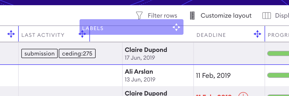
Reorder columns by dragging headers. Adjust width by resizing headers. Changing row height updates `rowsHeight`.
### Filtering Configuration
Filtering configuration determines both the interface and the logic for executing filters. For example:
```json theme={null}
{
"type": "text",
"path": "name",
"interpreter": {
"type": "search"
}
}
```
#### Configuration Fields
* **type**: Specifies the filtering interface type.
* **path**: Defines the data path to filter. Paths pointing to objects are stringified for global searches.
* **interpreter**: Configures filtering logic (default: `{"type": "search"}`).
Column-specific filtering can be customized using the `filter` field in column configuration. For example, nested information (e.g., tooltips or modals) can use custom filters. By default, rows with `undefined` values are excluded.
### Filtering Interface Types
#### Text Filtering
A text input with a debounce of 250ms updates filters. Multiple filter values can be specified using commas.
* **placeholder**: Optional text displayed when the filter is empty (default: `search`).
#### Filtering Interpreter Options
* **Search Filter**: Filters by matching substrings (case-insensitive).
* **Regex Filter**: Filters using regular expressions.
* **flags**: Options like `i` for case-insensitivity.
* **Number Filter**: Filters by numeric comparisons. Supported operators include:
* `n`: Exact match.
* `n`: Less/greater than.
* `n<
#### Configuration Example
For dates:
```json theme={null}
{
"filter": {
"type": "select",
"path": "data.weekStartDate",
"enum": [
{ "label": "10/05/2021", "value": "2021-05-10" },
{ "label": "05/10/2022", "value": "2022-10-05" }
]
}
}
```
For numbers:
```json theme={null}
{
"filter": {
"type": "select",
"path": "data.progressValue",
"enum": [
{ "label": "10%", "value": "0.1" },
{ "label": "50%", "value": "0.5" }
],
"interpreter": { "type": "number" }
}
}
```
***
## Aggregating
For locally stored tables, aggregation computes operations on the entire dataset. Activating the aggregation switch adds a new row at the bottom of the table.
### Global Aggregation Configuration
Customize the aggregation switch label using:
```json theme={null}
"aggregation": {
"label": "Custom Switch Label"
}
```
### Column Aggregation Configuration
Aggregation is defined per column. The widget receives the entire dataset:
```json theme={null}
{
"data": [ {...rowData} ]
}
```
#### Example: Average Calculation
To compute the average of a column:
```json theme={null}
{
"view": {
"path": "data[].amount | avg(@)",
"type": "number"
}
}
```
Default behavior:
* Numerical columns: Summation.
* Other columns: No aggregation.
***
## Customization
Table customization allows users to adjust the display to their needs. These preferences are stored in the browser's local storage and persist until cleared manually or programmatically.
### Local Storage Structure
Example:
```json theme={null}
{
"rowsHeight": 42,
"columns": [
{ "key": "name", "width": 75, "filter": "claire, paul" },
{ "key": "age", "filter": "<=40" }
],
"sortSetup": { "key": "age", "direction": "d" }
}
```
Fields include:
* **Selected columns**: Order and visibility.
* **Row height**.
* **Sorting setup**.
* **Filters**.
### Layout Customization
#### Display Menu
The **Display Menu** allows column selection. Adding a column appends it to the end of the `columns` list, while removing one deletes its entry.
#### Drag-and-Drop Reordering
Reorder columns by dragging headers. Adjust width by resizing headers. Changing row height updates `rowsHeight`.
 #### Performance Note
Re-rendering occurs only after mouse release to enhance performance. Future improvements could include debounced updates (e.g., triggered after 250ms).
***
## Exporting the Table
Data can be exported as a CSV file using the **Export** icon in the table headers. Exported data respects the current display configuration (sorting, filtering, column selection).
### Export Configuration
Example:
```json theme={null}
{
"exportCsv": {
"filename": "My Export",
"delimiter": ","
}
}
```
* **filename**: Prefix for the exported file (final name includes the current date).
* **delimiter**: Default: `;`.
***
## Templating
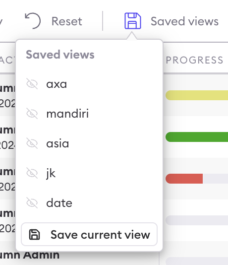
Templating predefines display configurations users can toggle via the **Display Menu**. Selecting a template replaces the local display configuration.
### Template Configuration
Example:
```json theme={null}
{
"defaultDisplay": {
"columns": [
{ "key": "name" },
{ "key": "age" }
]
},
"templates": [
{
"label": "Advanced",
"displayConfig": {
"columns": [
{ "key": "name", "width": 75, "filter": "claire, paul" },
{ "key": "age", "filter": "<=40" }
],
"sortSetup": { "key": "age", "direction": "d" }
}
}
]
}
```
* **defaultDisplay**: Default table view.
* **templates**: Additional labeled configurations for quick toggling.
#### Performance Note
Re-rendering occurs only after mouse release to enhance performance. Future improvements could include debounced updates (e.g., triggered after 250ms).
***
## Exporting the Table
Data can be exported as a CSV file using the **Export** icon in the table headers. Exported data respects the current display configuration (sorting, filtering, column selection).
### Export Configuration
Example:
```json theme={null}
{
"exportCsv": {
"filename": "My Export",
"delimiter": ","
}
}
```
* **filename**: Prefix for the exported file (final name includes the current date).
* **delimiter**: Default: `;`.
***
## Templating
Templating predefines display configurations users can toggle via the **Display Menu**. Selecting a template replaces the local display configuration.
### Template Configuration
Example:
```json theme={null}
{
"defaultDisplay": {
"columns": [
{ "key": "name" },
{ "key": "age" }
]
},
"templates": [
{
"label": "Advanced",
"displayConfig": {
"columns": [
{ "key": "name", "width": 75, "filter": "claire, paul" },
{ "key": "age", "filter": "<=40" }
],
"sortSetup": { "key": "age", "direction": "d" }
}
}
]
}
```
* **defaultDisplay**: Default table view.
* **templates**: Additional labeled configurations for quick toggling.
 ## Learn more about tables
All [views](/configuration/ui/widgets) available in the tables and how to make them editable [here](/configuration/table/views)
## Learn more about tables
All [views](/configuration/ui/widgets) available in the tables and how to make them editable [here](/configuration/table/views)